Sizing on a Product Page
Note: I wrote this piece as part of a broader UX benchmarking report related to product sizing.
Introduction
This article explores best practices for designing effective product size selectors in e-commerce. Drawing from real user interactions and design patterns across leading retail sites, it highlights common friction points, such as lost size selections when switching colors, unclear availability, poorly placed error messages, and hidden size options. The goal is to help designers create intuitive, user-friendly interfaces that reduce frustration and support seamless product selection.
Always Persist a Selected, Available Size Across Colour Variations
Issue
When users select a size and then switch to a different color of the same product, many sites reset the size selection, even when the size is still available in the new color. This forces users to reselect the same size repeatedly, adding unnecessary steps and increasing the risk of errors (e.g., forgetting to reselect the size before attempting to add to cart).


Cos force users to re-select size for the same product in a different colour.
Advice
Once a user has selected a size that’s available in multiple colors:
Persist the size selection across colour changes whenever the size remains available.
Only clear the selection if the size is unavailable in the new color—and clearly indicate why.
Use messaging like “Size M no longer available in Blue” if deselection is necessary.
Core UX Issue: Repetitive Interaction Breaks Flow
Resetting the size selection breaks the user’s workflow, especially for shoppers who want to explore colour options after identifying their size. When users must repeat steps, it increases friction and introduces errors, especially on mobile.
“I was just trying to see what it looked like in another colour, but now it’s making me pick my size again, I already did that!” Test Participant #16
Implementation Guidance
Track the user’s size selection in session state.
When the colour changes, check availability of the selected size.
Automatically re-apply the size if available, or notify the user if not.
Avoid silent deselection—this often leads to confusion at checkout.
Example
Lululemon maintains size selections when users browse other colours, making it easier to compare options without reselecting the same configuration.

Lululemon persists with the selected size as the user navigates between colour options.

Core UX Solution: Respect the user’s prior input
Persisting a selected size across colours streamlines the browsing process and helps users reach a confident decision more efficiently.
Once a Size or Colour Has Been Selected, Always Indicate Unavailable Variations
Issue
When users select a size or colour for a product, it’s often unclear which other variations (e.g., colour/size combinations) are no longer available. This forces users to manually test each option or click into unavailable variants, increasing frustration and abandonment risk.
During testing, users frequently misinterpreted what was in stock, especially when a previously selected size did not update available colours, or vice versa. In some cases, unavailable options weren’t clearly marked, or worse, still appeared selectable, leading to error messages only after an “Add to Cart” attempt.

Asos does not indicate unavailable colours once size is selected, forcing users to waste time on trial and error.

Advice
Always reflect selection logic in real-time. When a size or color is selected:
Dynamically update and visually disable any unavailable combinations.
Use clear visual cues (e.g., greying out, cross-outs, tooltips with “Not available in selected size”).
Never allow users to select or add-to-cart an unavailable combination.
Core UX Issue: Avoiding Selection Dead Ends
Failing to indicate unavailability upfront leads users into dead ends, wasting time on trial-and-error selection and leading to unnecessary error messages. This breaks trust and reduces perceived reliability of the site.
“I clicked the colour, and it looked like I could get it in Medium, but after clicking Add to Cart it just told me it’s unavailable—that’s annoying.” — Test Participant #4
Implementation Guidance
Use two-way synchronisation between variation selectors.
A colour choice should update available sizes and vice versa.
Apply real-time validation to keep the interface responsive. Provide a clear reason when something isn’t available (e.g., “Out of stock in selected size”).
Example: Nike clearly indicates unavailable colours once size is selected.

Nike clearly indicates unavailable colours once size is selected.
Core UX Solution
Dynamically indicate availability constraints based on user selections and prevent invalid combinations from being chosen. This helps users navigate products more efficiently and builds confidence in the purchase process.
Display Clear, Non-Intrusive Error Messages Near the Size Selector When No Size is Chosen
Issue
Error messages outside the user's field of focus are easily missed, making issues harder to resolve.
When error messages lack visual contrast, they blend into the page and frequently go unnoticed.

REI error messages are located outside the user’s field of focus causing confusion.
Advice
Ensure error messages are displayed inside the user’s field of focus, directly adjacent to the size selector component.
Use high-contrast styling such as red text on a white background with bold borders to ensure they're noticeable without being visually disruptive.

Asos position error messages within the users field using high contrast styling.
Research Findings
On e-commerce platforms, selecting a size is often a required step before adding a product to the cart. Yet, usability testing has shown that many users encounter avoidable friction when this step is overlooked. This is not because users are unwilling to comply, but because they are unaware they’ve missed it. When users attempt to proceed without selecting a size and are not immediately shown a clear and proximate error message, confusion arises. This miscommunication results in disrupted shopping sessions, repeated failed attempts, and ultimately, lost sales. This guideline outlines how strategically positioned and clearly styled inline error messages can significantly improve the user experience.
Core UX Issue: Unclear or Poorly Positioned Error Messages Obstruct the Path to Purchase
Usability testing identified many instances where users attempted to add items to their cart without selecting a size and missed the related error message.

The font used in the error message on Columbia’s website is very small, it blends in with other red text items on the page and can be easily missed. Okay, that was weird, I don't know why it didn't add before. — Participant #8
“Okay, that was weird, I don't know why it didn't add before.”
— Participant #8 Using Columbia.

Hush Puppies error messages were often overlooked due small font and insufficient visual prominence.
“Hmm, It's not letting me add eight and a half. It looks like the site, it's having some issues. So I'm just going to refresh the site and help it.”
- Test Participant #3 using Hush Puppies
The placement of error messages is a key usability issue. During usability testing, multiple error messages were located far outside the users’ field of focus or featured low-contrast messages that were overlooked. Without visually prominent, and appropriately placed feedback, users are left guessing why they can’t proceed.
Core UX Solution: Display Inline, High-Visibility Error Messages Adjacent to the Size Selector
To address this issue, error messages should be displayed inline and positioned directly adjacent to the size selector component. Nike is a strong example of successful implementation, error messages are shown both above and below the size selector, framed in a red box with high-contrast text. During testing, this approach was immediately understood by users, who quickly corrected their action and continued with checkout.

Nike error messages are clearly framed in a red box using high contrast text.
Messages should use clear, specific language to eliminate ambiguity. They should remain persistent until the issue is resolved, ensuring that users have enough time to notice and understand the message. These messages must be visible in the same area where the user is focused, rather than appearing at the top of the page or near unrelated form elements.
Implementation Details: Placement, Style, and Accessibility
To ensure effectiveness, the error message should be:
Placed directly adjacent to the size selector so users can easily identify what needs attention without shifting their focus.
Messages must remain visible when the user taps or clicks "Add to Cart" and should not require scrolling to be seen.
Styled with high contrast, such as red text on a white background with bold borders, making it difficult to overlook, without being visually disruptive.
Written in clear, action-oriented language that informs the user exactly what is required (e.g., “Select your size”).
Accessible to screen readers, using proper ARIA attributes and role notifications to announce the message to visually impaired users.
By following these principles, e-commerce sites can significantly reduce cart abandonment caused by overlooked size selections, improve the clarity of the shopping experience, and build user confidence through better feedback mechanisms.
Use Individual “Buttons” for Each Size Variation
Issue
When size variations are presented in dropdown menus or abstract selectors (like radio buttons with unclear labels), users often struggle to recognise all their options or determine availability at a glance. This can lead to missed options, incorrect selections, or hesitation due to ambiguity.
Asos display size options in a dropdown rather than providing size availability at a glance.

Testing consistently showed that individual size “buttons”—such as clearly defined, clickable boxes labeled with sizes, outperform dropdowns and generic lists. Participants reported they could more easily assess which sizes were available or out of stock, and interaction was more fluid.
Advice
Replace dropdowns or compact menus with individual, clearly labeled buttons for each size variation:
Buttons should show the full range of sizes (e.g., XS–XXL, 6–16) in a visually scannable layout.
Use distinct visual cues to mark selected, available, and unavailable sizes.
Disable or cross out unavailable sizes while keeping them visible (never hide them completely).
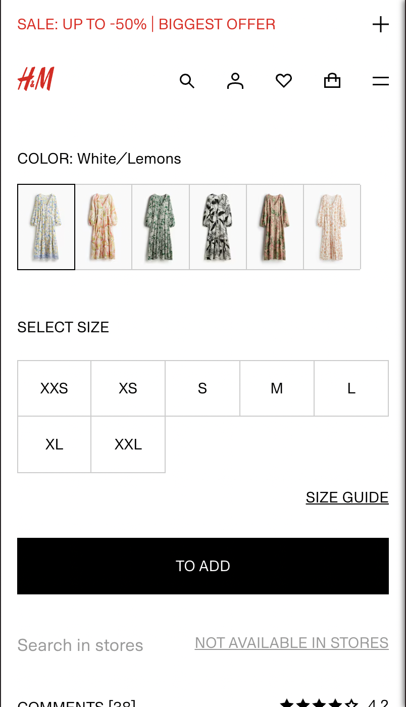
H&M and & Other Stories both display full size range in a scannable layout.

Core UX Issue: Poor Visibility Reduces Selection Accuracy
Dropdowns bury options, especially on mobile, and prevent users from getting a quick overview of what’s in stock. This can result in unnecessary trial and error and reduces confidence in the interface.

Farfetch hide size availability in a dropdown.
“I didn’t even realise they had any left for 36 months because I couldn’t see all the options.”
— Test Participant #5
Implementation Guidance
Use a grid or row of buttons styled to indicate active/inactive states.
Provide clear visual contrast for hover/selected states.
Mark unavailable sizes with visual strikethroughs or tooltips (e.g., “Sold Out”).
Make the buttons large enough to be easily tappable on touch devices.

Adidas and Levis display sizes in rows allowing users to quickly scan availability. Levis use strikethroughs with inactive state to show availability.

Core UX Solution
Expose all size options at once using individual buttons with clear states. This improves scannability, speeds up selection, and makes it easier for users to make confident, informed decisions.
Design for Ease and Confidence
Designing an intuitive size selector isn’t just about aesthetics, it directly impacts user confidence, satisfaction, and conversion. By addressing common usability issues and applying these best practices, designers can create a smoother shopping experience that minimises confusion and supports quick, informed decision-making. Even small improvements to this element can have a measurable effect on overall performance, making it a crucial area for ongoing optimisation.