CarTrawler
A UX transformation that streamlined car rental selection and increased conversion.

The Challenge
As part of its product development CarTrawler identified the Downtown car-hire experience as an opportunity for growth. A Downtown car-hire is where a customer hires a car at any location that isn’t an airport.
The project required a design strategy that leveraged data and qualitative insights.
The objective was to increase the overall conversion rate of Downtown bookings by at least 4% on the overall Downtown funnel via a series of refinements to the booking engine experience. The solution needed to seamlessly integrate with airport car hire, ensuring no negative effect on airport conversions.
Insights
I ran usability testing with 12 users and identified the below usability issues.
Usability Test Outcome
Step one for both mobile and desktop:
The more specific the search term the user used, the better they understood the results, e.g hotel name vs city name
Users want to hide content irrelevant to them
Truncated address search results hinder users ability to identify location
On step two for mobile:
Facilitate easier comparison of supplier vehicle types
Improve the findability of supplier information
On step two for desktop:
Users assumed only suppliers whose logos were on the homepage were included in the search
Make comparison easier
Review the use of a map to display supplier locations as it didn’t align with users’ expectations
Allow users to refine their search
Ideation Workshop
I facilitated two workshops to generate ideas for potential solutions. The outputs of this then informed wireframes and designs.
Mobile Designs
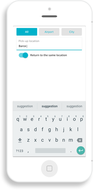
Search Solution: Hide Irrelevant Content Iteration i
This solution allows users to tab through airports and city locations. However, the filters are presented too early and don’t address the user’s problem at the right moment. Also, ‘city’ is too general and doesn’t communicate that the search covered small towns and villages.

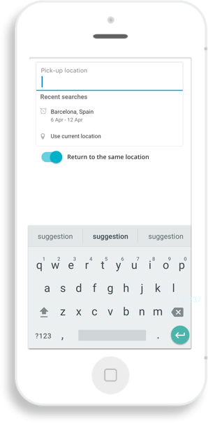
Search Solution: Hide Irrelevant Content Iteration ii
This solution allows users to switch off airports. The switcher appears after Google Places loads. The Downtown users are presented with a solution once the problem of irrelevant content arises.

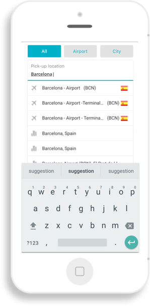
Truncated Address String
When only the first line of an address is displayed users were unable to identify their hotel. Display the address over two lines displays more of the address.


Results Display
Results grouped by supplier, with a horizontal scroll to view more
Supplier rating and address is easily discoverable addressing the issue of findability of supplier information, discovered in testing

Users can also view a dedicated supplier page by tapping on the car or following a link that appears in an overlay on the fourth swipe.
This encourages users to progress to the next step while also allowing them to return to the previous view.
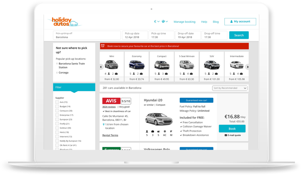
Results Display Desktop
The map was removed from the results page and replaced with a list as the map confused users and a list alligned with their expectations.
If people use a generic search they have the option to redo their search with one of the suggested pick-up locations.
Interstitial page
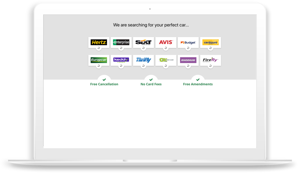
An interstitial page was included as users thought aggregation was limited to the supplier logos on displayed on the homepage.
Outcome
The redesigned booking experience delivered measurable improvements across the user journey. By streamlining decision-making and presenting key information more clearly, the new flow led to a 4% increase in conversion rates in the first month—a significant uplift at CarTrawler’s scale. Enhanced accessibility and content clarity reduced user friction across devices, while the user-centered approach ensured both customer needs and business goals were met. The final design became a scalable, performance-driven foundation for future product development.