Turning Scattered Feedback into a Product Roadmap
Building a standardised feedback taxonomy and research repository to help Ontada Health prioritise patient and practice improvements.
Ontada Health's products are used by patients, caregivers and practice staff. Feedback from all three groups existed, but it was scattered across systems, so there was no single view of what users struggled with or which problems mattered most. I led a project to consolidate it, classify it consistently and turn it into evidence for prioritisation.
Project Overview
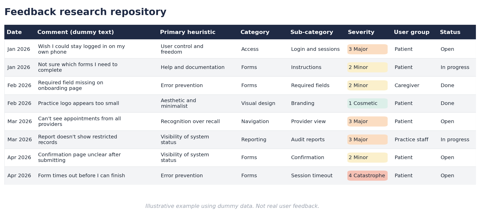
I compiled feedback from five sources into one central repository.
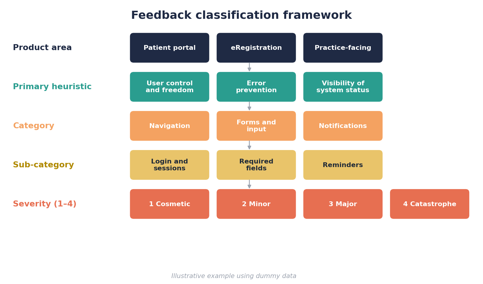
I designed a standardised taxonomy (product area, category, sub-category and severity) so feedback can be tagged and compared consistently.
I mapped every comment to a usability heuristic to show where the experience was breaking down.
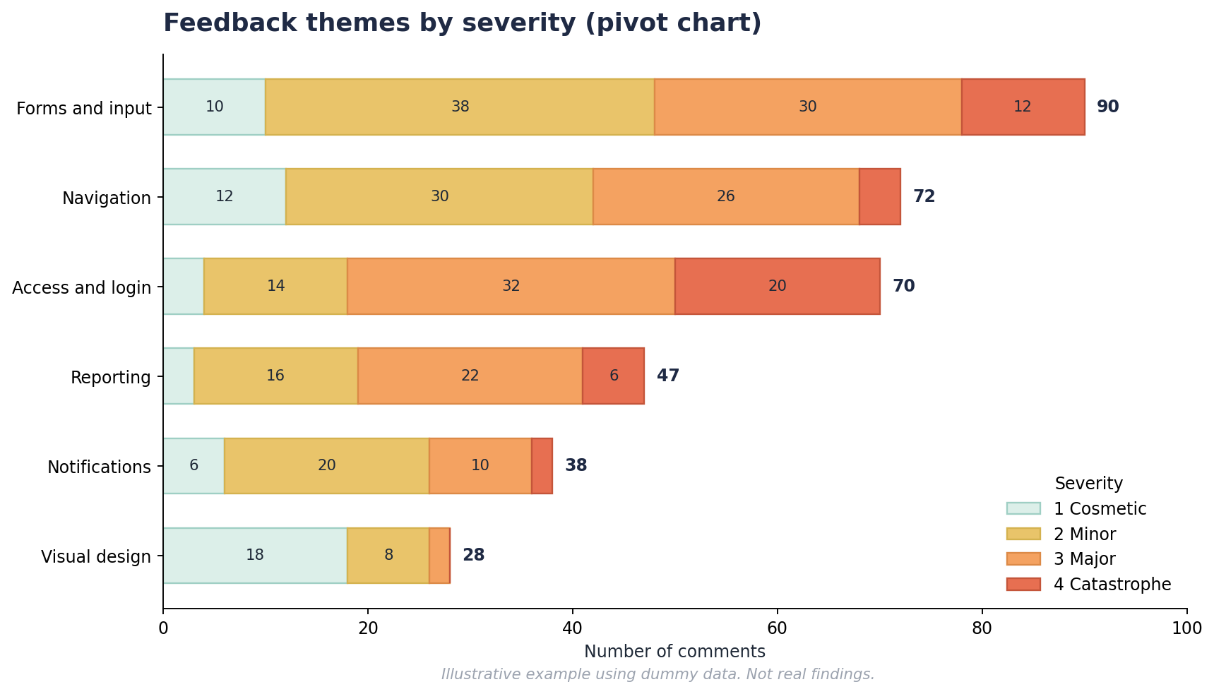
I used pivot charts to surface common themes quickly.
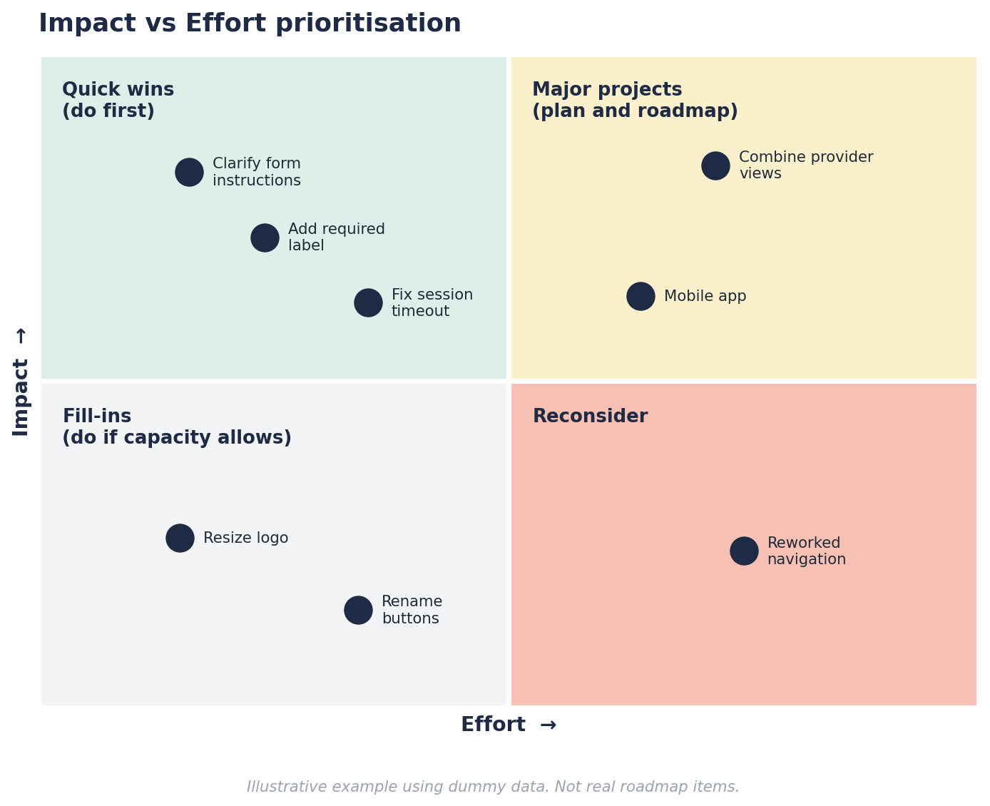
Findings fed into Impact vs Effort workshops, which produced a roadmap for the year ahead.
I built a script so new feedback can be analysed in seconds instead of being read and categorised manually.
The Challenge
Feedback about Ontada Health's patient portal, patient eRegistration and practice-facing tools came in through:
Jira
ServiceNow
Patient feedback submissions
SUS survey responses
Conversations with practices
Each source had its own format and its own priorities. Comments couldn't be compared across channels, patterns were hard to spot, and product decisions risked being driven by whoever shouted loudest rather than by what affected the most users.
The question was: how do we get one consistent, evidence-based view of user pain points across three very different product areas?
Research Approach
1. Consolidate
Pulled all existing feedback, 1,000 pieces in total, into a single central source.
Kept the three product areas separate so each could be analysed on its own terms:
Patient portal
Patient registration (eRegistration)
Practice-facing Ontada Health
Captured the metadata needed for later analysis, such as date, user group (patient, caregiver, practice staff) and status.
2. Classify
Every piece of feedback was tagged against a structured taxonomy:
Product area: where in the ecosystem the issue occurred.
Primary heuristic: which usability principle was affected, using Nielsen's 10 usability heuristics. For example, "User control and freedom" or "Error prevention".
Category and sub-category: the type of problem, developed bottom-up from the data.
Severity: how seriously the issue affects users, rated on a 1–4 scale based on the Nielsen Norman Group's severity ratings:
1 – Cosmetic: a nice-to-fix problem with low priority.
2 – Minor: a small usability problem that causes some friction.
3 – Major: a significant problem that should be fixed as a priority.
4 – Catastrophe: a problem that prevents users from completing tasks and must be fixed.
I built the category and sub-category structure inductively. I began with a first pass, flagged unclear items for review and refined the taxonomy until comments could be tagged without ambiguity.
3. Analyse and prioritise
Ran a thematic analysis within each product area.
Built pivot charts to see which themes, heuristics and severity levels came up most often, and to compare patterns across user groups and product areas.
Ran Impact vs Effort workshops with stakeholders to agree priorities.
Designing the Taxonomy
Free-text feedback is messy. One comment can be a bug report, a feature request and a complaint at once, and users rarely describe problems in product terms. A comment like "I do not like how you have to log back in if you get out of the browser" is really about user control and freedom, not about login.
Anchoring each comment to a recognised heuristic gave the team a shared language for usability problems, so the analysis didn't depend on my interpretation alone. It also let me compare feedback across sources and products that would otherwise be hard to line up.
Some design decisions:
Rules for split comments: where one comment raised several issues, I tagged each separately so that no problem was hidden inside a longer message.
A "Needs Review" state: ambiguous items were flagged and resolved later rather than forced into a poor fit.
Separate views per product area: each area has its own comments, analysis and tag sets, plus a shared Impact vs Effort view for cross-product decisions.
Key Findings
Due to of the sensitive nature of this work, I can't share specific findings. In broad terms, the analysis showed:
Clear, recurring themes within each product area, so the team could see where problems clustered rather than relying on individual anecdotes.
Patterns that varied by user group, with patients, caregivers and practice staff often struggling with different things.
A spread of severity levels, which let the team separate the issues that were serious from those that were merely frequent.
Pivot charts made these patterns easy to see and share with stakeholders, which kept workshop discussions grounded in the data.
From Insight to Prioritisation
Findings alone don't change a product, so I brought them into Impact vs Effort workshops with stakeholders.
Each theme was presented with its volume, severity and heuristic mapping, so the discussion started from evidence.
Stakeholders placed issues on an Impact vs Effort matrix, which made trade-offs visible.
The workshops produced:
A roadmap for the coming year, based on agreed priorities.
Quick fixes, prioritised and assigned to the relevant team members.
Visibility of what was already done. Some items had already been resolved, and identifying them let teams see which improvements had already been made.
A Repeatable Process
A one-off analysis goes stale quickly, so I wanted the framework to keep working after the project ended.
I set up a script so that new comments added to the repository can be analysed in seconds rather than being read and categorised one by one. This lets teams pull trends from the data quickly and easily, without needing a researcher to run a fresh analysis each time.
Impact
Over 1,000 pieces of feedback were analysed and brought into one consistent structure.
Feedback from five channels now lives in one place and follows one taxonomy.
Stakeholders left the workshops with a year-long roadmap and clear ownership of quick fixes.
Teams can see which improvements have already been delivered.
New feedback can be analysed in seconds, so the research keeps informing decisions after the project.
Reflections
Consistency is a design problem too. A taxonomy is only useful if other people can apply it the same way, so clear definitions mattered more than clever categories.
Volume isn't priority. Pairing severity with frequency stopped isolated but emotive comments from skewing decisions, and stopped high-volume minor annoyances from crowding out serious issues.
Structure makes feedback reusable. The real value is that next quarter's feedback slots straight into the same framework.
See More Of My Work
Improving At-Home Lab Result Experiences Through UX Research
Solving Product Sizing with User-Centred Design
Redefining Travel Booking UX for CarTrawler